
How to pick a paint colour
It’s Saturday and you have decided that you are going to paint the bedroom this weekend. You know you want it light blue – so how hard can it be to choose a paint?
Now you are standing in the paint section of the DIY superstore, which is lit by florescent light, staring at a million paint cards. There’s no time for samples as you just want to get the job done so you’ll select that fabulous shade which should be called “Random Panic Pick” by “the cheapest paint possible” for the room.
Monday night you have finished decorating the room (no-one actually finishes the same weekend!) and there is the dawning realisation that you have made a terrible mistake and your room looks awful, but hey you have decided to ignore it and live with it.
That is how NOT to pick a paint Colour! This is “design in haste, repent at leisure.”
So how do you get it right?
Think of the room as a whole
A paint colour is the thing that holds the design of a room together. Sometimes it’s the drama in the space, especially when you go dark. Sometimes it’s the backdrop to the other things that bring the drama – like a crazy fabric on the upholstery. You have to approach the space and all the components as a whole and find balance in what you put together.
Think of it like food. Yes you like strawberries and yes you like Salt and Vinegar crisps but putting them together doesn’t make a nice meal.
Preparation!!
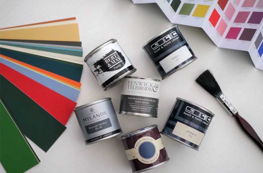
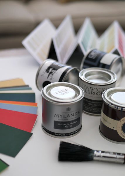
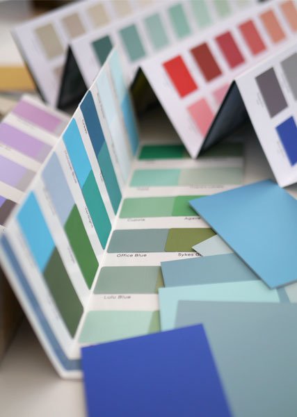
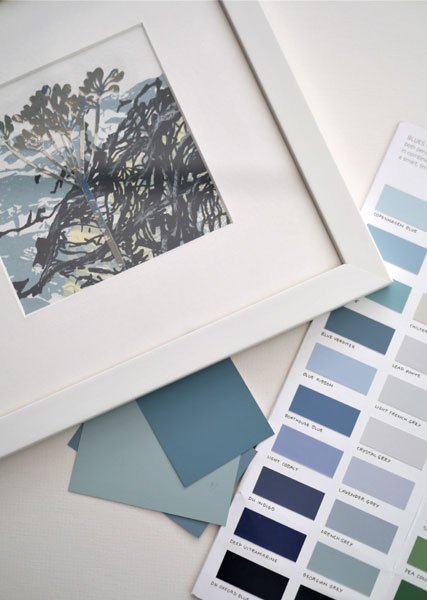
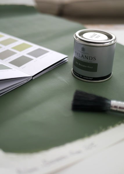
Okay so you have a ball park idea of what paint colour you want to go with, for arguments sake let’s say light blue. The first step is to gather your paint charts and start Round One of narrowing it down to the correct colour. If you are picking up a “light blue” that is in a painting, wallpaper or that crazy fabric, then hold the charts next to the “launch pad” piece and see which are the closest matches. Try to narrow you paint selection down to a maximum of 5.
For Round Two get samples of these 5 paints. I always recommended getting them mixed up, as there can be colour variation between the off the shelf sample pots and the mixed paint sample. Paint these up on plain wall lining paper. Make those samples nice and big and label them. I have seen many people finally find the right colour and not remember which one it was as it wasn’t labelled. Now tape those samples to the wall in the room you are planning to paint. Light affects how colour appears; you have to view it vertically as light bounces differently off it here than when it’s flat. Look at the samples at all different times of the day and under all your lighting situations. Only then can you tell if it’s working for you.
If I have used a painting as my inspiration I like to tape the sample next to it so I can see how they are working together. It’s amazing how many times I think I have found the perfect colour when looking at paint charts to find it’s a terrible match when a sample is painted up.
Round Three is select you best match. And if none of these are working then head back to Round One with the paint charts.
I know it can feel labour intensive and time consuming but I believe that if you design in haste, you repent at leisure. A little bit of extra time now can make the difference between a stunning room, or a stunning mistake. And let’s face it, no-one wants to paint a room twice!

It’s all about that base
You know how there is a base note in music. It’s the deep note that you don’t always notice but holds the song together. Paint colour is one of those and it will have a colour to it, either Red, Blue or Yellow. That’s why one light grey paint can look so good with the room scheme you’re building and another can look so terrible because if a scheme has a “blue base note” and a paint has a “red base note”, they will not be in tune with each other.
Pick the paint you can afford
I get really militant about this one. There is nothing wrong with picking a Dulux or a Leyland paint. They both have an amazing range of colours, especially the Dulux heritage range. But if you want a Farrow and Ball colour buy a Farrow and Ball colour. However, getting a Farrow and Ball colour made up in a Leyland paint mix doesn’t end well as the base from which the colours are mixed are a different colour in the first place. The result is that the end colour isn’t the Farrow and Ball shade you picked. I once watch a client save herself £40.00 on paint by mixing up a cheap knock off, to find her Windborne White soft subtle kitchen was in fact light lilac. It had cost her over £1000.00 in professional decorating to redo the whole room in the correct shade. Not much of a saving after all.
It’s time we stop being paint snobs about the mainstream brands, especially if that is the price bracket we want to pay.