
Balancing your colour scheme with the 60/30/10 rule

A beautiful room design is a “work of art” and lots of different things are working in it to build a space with interest and personality. To pull this off I am always balancing lots of different elements like textures, use of space and colour.
Designing the flow and use of a space involves balancing the harmony of fitting everything you want to go on it without crowding. However, a huge amount of impact that a room has on us is down to the design of colour.
One of the most useful ways of balancing colour is to the “Design Rule” of 60/30/10. The basics of this are that you have 60% of one colour, 30% of another and a little flourish of 10% of a final one.
But how do you use this in a room?

The “60%”
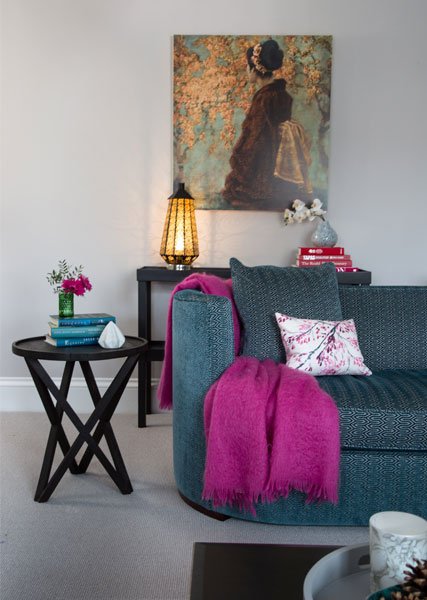
This is the dominant colour in the room and easiest to incorporate if you use it on the walls and floors. I like to think of it as “my canvas” – the base for the other colours to be layered on. Don’t think that these all need to be exactly the same colour, they just need to be in the same family of colours. Let’s say you use a Light Grey on the wall then your floor might be a dark grey wood, both are in the camp grey but you have depth by using different shades.
The “30%”
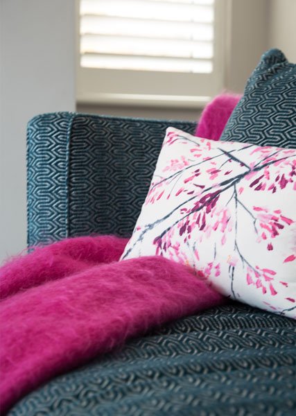
30% doesn’t sound much but you can do an awful lot this layer. I like to use this as my “Soft” stuff in the room; upholstery, rugs and all the big textiles. Like the walls and floors, you can play around with shades, but also play around with textures. I always try to keep things from become flat. A “flat” design, one with little variation in surface and texture, is just boring and lifeless. A combination of textures reflect light in different ways so the room has a depth to it. Check out my previous blog post that talked you through layering your textures.
The “10%”
The 10% is your accent colour – your accessories, cushions, throws, vases. This is the delicate touch used to liven everything up.
How do you pick your three colours?
Like casting a Hollywood movie, you should look to put your “Star” in place first and then add the supporting cast to compliment them. In a room I will look for my “Star” and it becomes my springboard into the design. I often find Art a great place to build a colour scheme from. A lot of the time the artist has done most of the “heavy lifting” for you by balancing the colours together. Also, if it is an art piece you love, then it is likely to be full of colours that make you happy. Other places to look for inspiration are bold fabrics and rugs.
Use the rule to play with pattern.
I sometime play around with this rule to add pattern. If you want a splash of pattern then use it in your 30% layer. Patterned upholstery is the must do thing right now in interiors and makes one bold statement in a room, while the other elements sit back. If you like your pattern combination a bit more “full on” then go with a patterned wallpaper for you 60%, keep it plain in your 30% and then go pattern crazy in the 10% with your cushions.

How strict do you have to be about it?
All Design Rules are really Design Tools. The 60/30/10 colours provide a good framework for the room, but of course you can drop other colours in. It’s a room that is meant to reflect your personality and contain things you love in it. If you are hiding away the yellow vase you love and bought while on your honeymoon, because you have gone with a grey, green and pink room, think again. It might need a little yellow accessory friend somewhere else in the room so it doesn’t stick out like a sore thumb … but don’t box him away.
You just need to keep on playing with stuff. You can tell if you have introduced something that jars with your eye. Introducing touches of white or black also stop things from becoming to formulaic and make bringing a few other colours in possible when grouped together.
What if you love using lots or colours in a room?
Then this probably isn’t the Design tool for you. The great thing about design is that there is always a guideline that helps you build harmony in the type of space that is just right for you. The 60/30/10 rule helps create a balanced interior scheme for people that love colour but like to keep it calm. It’s there to help if that is the direction you want your space to go. That’s all. The design police aren’t going to bash your door down if you have every colour of the rainbow on every object in your house!