
I can feel a rainbow – The psychological effects of colour

There are a few questions in life we are asked that we feel are meant to define who we are: “What’s your name?”, “Where do you live?” and “What is your favourite colour?” But why is whether we like red or green important? If we like red, do we only like to hang out with other people who also have that favourite colour? Of course not, that would be silly! But what makes us happy about certain colours and hate others is a very emotional reaction. Colour psychology has been around for a while but there is starting to be a big resurgence in interest in it, especially to define yourself via a seasonal palette of colours. BTW, Smartstyle Interiors is a striking Autumn!
How we see colour varies throughout our lives. Babies react to primary colours because their eyes can compute those as distinct colours. Interestingly enough, these are the same colour ranges used in dementia care as older people can’t define the subtlety and shadows between colours so need a big distinction between items.
Colour psychology is a rabbit hole of wonderful research, but I thought I would just give you a few facts along with some of the positives and negatives about each colour of the Rainbow to help you understand why we use them and what they are making you feel.
Red
This is the “hot” colour and a stimulating one. It wants to do “DO stuff”. If we go back to some very basic colour theory, all colours are in fact light rays that travel to our eye. Red gets to our eyes first! Hence why it is the colour for danger and important road signs. They want you to see those from as far away as possible so you don’t drive off that cliff! If you paint a room red it will appear smaller as the walls will read as closer to you. Red is the colour of fire and can trigger our body’s fight-or-flight response, with increased respiration, blood pressure, appetite and metabolism. One science experiment involved researchers painting the interior of one horse stable red and another blue. In the red stable the horse was agitated and restless and they also noted an increase in temperature and flies in that space.
All of this would make you think using red in an interior would be bad, but it is all about where you use it and how. I would keep red out of a bedroom and a work environment as it can be stimulating and create stress and aggression. Because red stimulates appetite it was classically used in dining rooms but with its high energy I would see this working really well in a high intensity exercise environment. A dark maroon on the wall of that Spin class could really get you peddling your butt off! I often like using it as an accent colour in a room as a little can go a long way and really add some vibrancy to a calmer space. It is also my Christmas colour of choice as it has a comforting warmth to it which is associated with love and romance.
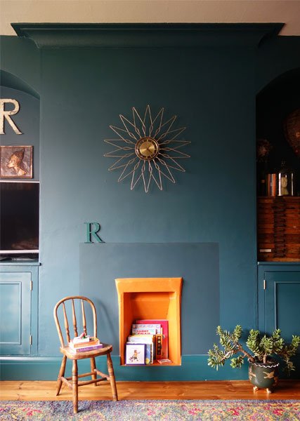
Great use of Orange in this living room by Making Spaces
Orange
Orange is another one of the stimulating colours and is associated with positivity. It can be seen as warm and cheerful, a nice combination of qualities from red and yellow. In the Sacral Chakra, orange is associated with the abdominal area of our bodies, including our kidneys, bowels, immune system and reproductive organs. Psychologically it represents pleasure, happiness, friendliness and joy. But orange isn’t always your friend. Being so close to red, the colour of danger, orange is also associated with fire. It makes us cautious and brings on a feeling of anxiety, with that sick to our stomach feeling. Used a lot in packaging where the brand wishes us to make a quick decision, it is the colour of bargain stickers.
As orange is a bright colour you don’t need much to make an impact. Terracotta floors are beautiful in a country style kitchen, making it feel welcoming and a happy place to be. An orange occasional chair in a moody blue room is a welcoming spot to read in. And a big orange fruit bowl might make a child make a snap decision to enjoy an apple over a Mars bar – sorry, that’s in my fantasy world, what was I thinking?! Well it might be worth a try…. For retail it could be a fab colour to use on the back wall of your shop, enticing people to look through the front window, all the way across your shop floor at what you have to offer.
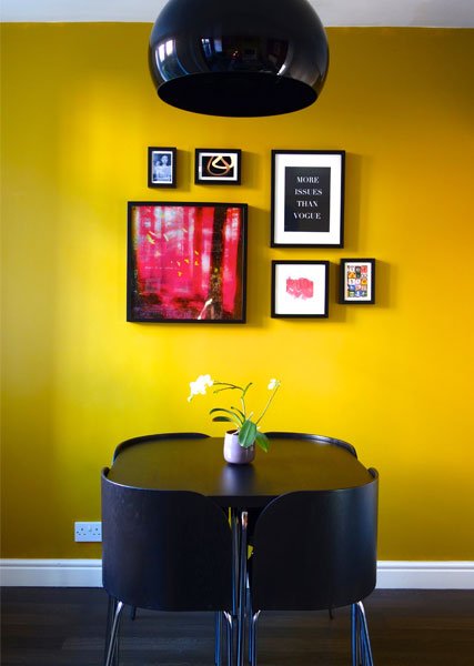
From full wall of yellow to accent cabinet in yellow it’s easy to bring this Happy colour to your home. Designs by Making Spaces
Yellow
Yellow is the sunshine colour and is seen as the happiest colour of all. It increases mental activity, awareness and energy. In 2010, Doctor Helen R Carruthers and Professor Peter Whorwell started research into Colour Mood and the associated effective treatment of IBS. To help analyse the mood of colour, they created The Manchester Colour Wheel that had a total of 38 colours and shades on it. These were then divided into groups of Positive, Neutral and Negative colours. Shining bright from the positive colour group were 3 different shades of yellow and when participants in the study were asked which colour they were drawn to, a higher percentage picked yellow. Some have called it the “happiest” colour, possibly including the delightful “Little Miss Sunshine” who is all about the yellow! It’s a colour full of energy, cheerfulness and optimism, like the dawn of a new day. But before you rush out and paint everything yellow to build that happy home, too much exposure to yellow has been shown to make adults lose their tempers and babies cry. Hmm, possibly not the best choice for the new nursery! Too much yellow can be a bit like spending too much time with an overly cheerful friend in a rainstorm; it could become tiresome and make us all a little waspish. Yellow is also the most tiring colour to the eye, so too much could hurt. In our interiors, like red, a little goes a long way. I often use it as the accessory colour to lift a room’s mood. Another great place to use it would be hallways or stairways where a bright sunshine hit could lift our moods but we are only passing through.
Photos thanks to American Paint company Benjamin Moore.
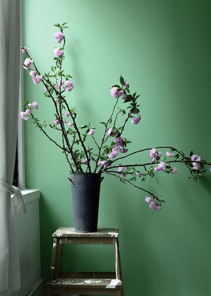
Green
Green is all about nature and is the king of the Biophilic colours. Biophilia shows that we all feel calmer if we have a connection to nature. There is a set of colours that are inspired by the natural environment that trigger a calming effect in us. I spoke about this in my original blog post on Biophilia. Green is the colour that restores balance and harmony and creates calm. In colour therapy, green is used to sooth the soul and mind; the chromatic treatment is used to regulate the pituitary gland, fight depression, irritability, insomnia and help in the recovery from nervous breakdowns. It is a colour that is all about creating a relaxed space. If you like to spend time unwinding in your living room then this could be perfect for you and an ideal fit for a nursery, especially as it’s gender neutral. I would also suggest using it in waiting rooms, a space where people are often feeling anxious. A predominately green scheme would calm them down before their appointment.
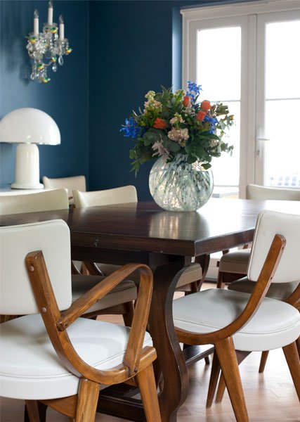
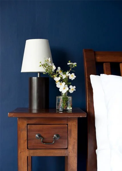
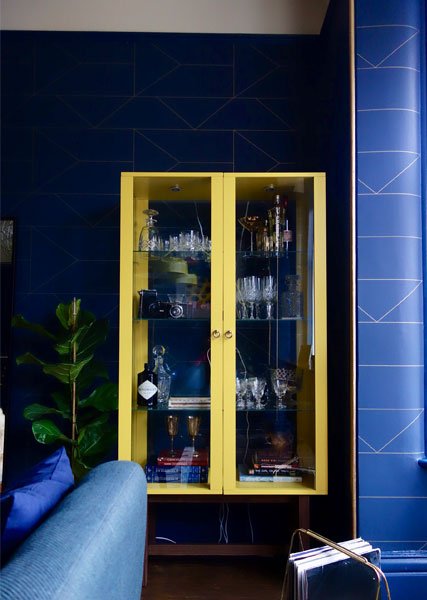
Blue
Blue is cool, calm and collected and the opposite of red. This colour’s light waves take the longest to travel to our eye. So, if you paint a room blue then the walls will appear further away, making the room appear bigger. Going back to the horse stable experiment, the horse in the blue stable behaved calmly and serenely, the stable appeared cooler than the red stable and there were fewer flies. Blue is shown to be relaxing and to slow both heart rate and breathing.
In my blog about sleep, blue ticks so many of the boxes for the ideal bedroom colour. I would also consider it for meditation and yoga spaces. As depression and anxiety seem to be on such a rise in the work place, blue is the perfect fit for offices. It can lower the heart rate, improve mental clarity and inspire creativity. It could be just what you need to chill the space and your employees out.
The shade of blue you use is really important. In Doctor Carruthers’ and Professor Whorwell’s research into Colour Mood and IBS they found different shades of the same colour produced different emotional reactions. “Pale blue was strongly positive whereas dark blue was negative.” With my fascination with Biophilic design, I wonder if that is because pale blue is calm seas and Summer days whereas dark blue is tempestuous storms and dark Winter’s nights. If your heart doesn’t warm to the drama and romance of the last two situations then your reaction to dark blue could be a stressful one.

Image from Swoon Editions
Indigo
Have you ever stared at a Rainbow and just decided that all the blues have merged together? The red, orange and yellow sections are clearly defined but the blues seem to blend into each other. Some theory goes that it is unlikely that indigo actually even exists in the Rainbow and there are only 6 colours. As well as being a great scientist, Sir Isaac Newton is believed to have been a bit of a fan of the occult where the number 7 was seen as a mystical number full of power and so Isaac added a 7th colour, indigo. Of course, indigo exists in real life. I see its properties as very similar to blue; but whether it really exists in the Rainbow is a hot debate that fascinates me.
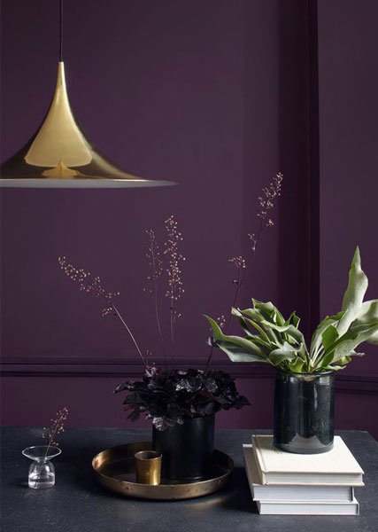
Images from Dulux “Wild Blackberry”
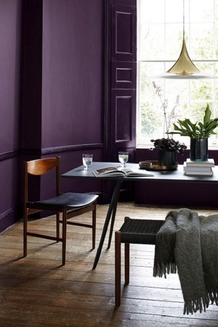
Violet
The colour of Bishops, Royalty, magic and luxury, sometimes this colour can feel out of reach for us mere mortals. Purple is a mix between red and blue so it carries with it some of the calming effects of blue and the stimulating aspects of red, often associated as the colour of imagination and spirituality. I have always found purple a hard sell for my clients, as it can almost feel too ostentatious when in dark hues or saccharine in light lilac, which often gets used in little girls’ rooms. However, maybe I’ve been looking at it all wrong and I should embrace its creative side, using it for family spaces and teenage dens. Commercially, it could work really well in a Hair Salon which needs the customers to feel calm and at peace but its stylists to feel creatively stimulated.
We don’t generally pick colours in our homes because we are told they can make us well or happy; we choose them because we love them and feel comfortable in them. I often find when working with clients that their reaction to colours they hate is associated with a very vivid memory: “I can’t stand mustard yellow, it reminds me of a jumper I had as a child in the ‘70s; it was itchy!” No amount of scientific definition can ever get you over your own emotional reaction to something. With interiors I love to understand the theories behind everything, but I also know we have to listen to our instincts when it comes to making a choice we want to live with. Think of it like finding your life partner. Just cos they are right on paper doesn’t always mean you want to wake up with them for the rest of your life!